UI/UX Design & Implementation • Motion Graphics
I was the sole UI content creator for the majority of the development of Destiny 2: Forsaken, the first and largest expansion to Destiny 2. I worked closely with artists and engineers to build UI for flagship features for the release including the new ‘Gambit’ PvEvP game mode and the new ‘Triumphs’ and ‘Collections’ UI features as well as updates to existing features like the mission director and Eververse storefront, owning feature development and implementation from initial concepts through final polish.
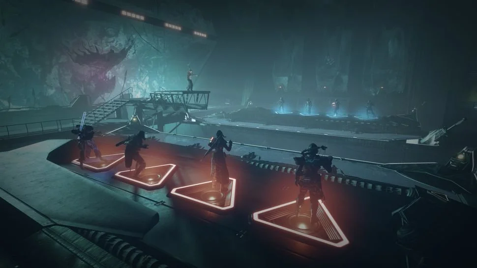
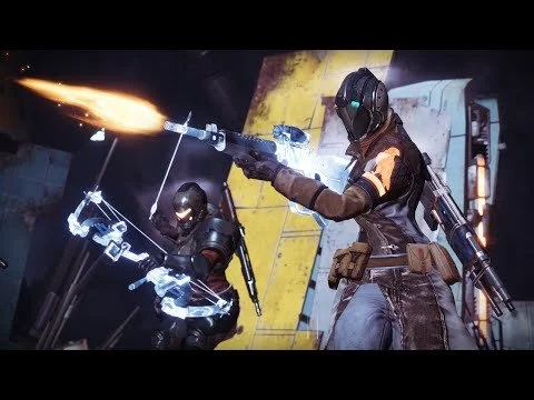
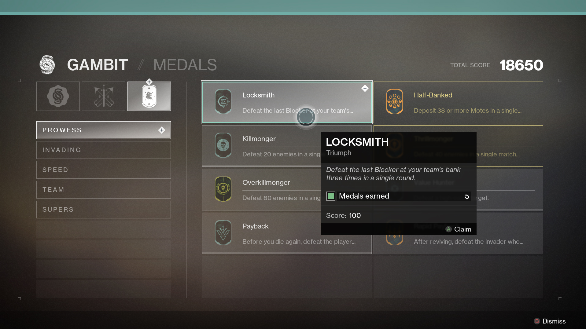
Gambit
In Forsaken we introduced a brand-new PvEvP game mode to Destiny 2, for which I was the primary UI content creator. I built and animated the in-match HUD including the all-new team state and invasion displays, as well as post-game results screens. It was a novel game mode which required communicating to players a variety of new information, while not cluttering the screen. I built UI content and motion graphics for the in-match HUD for team points, match progress, and invasion state alongside the post-game results sequences.


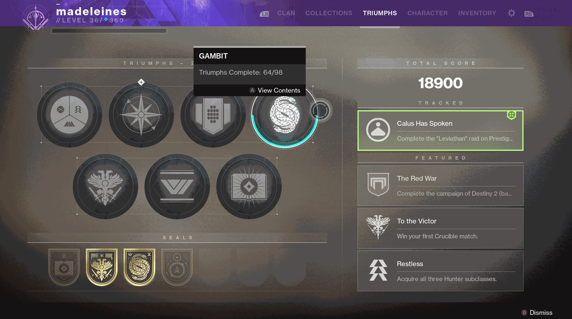
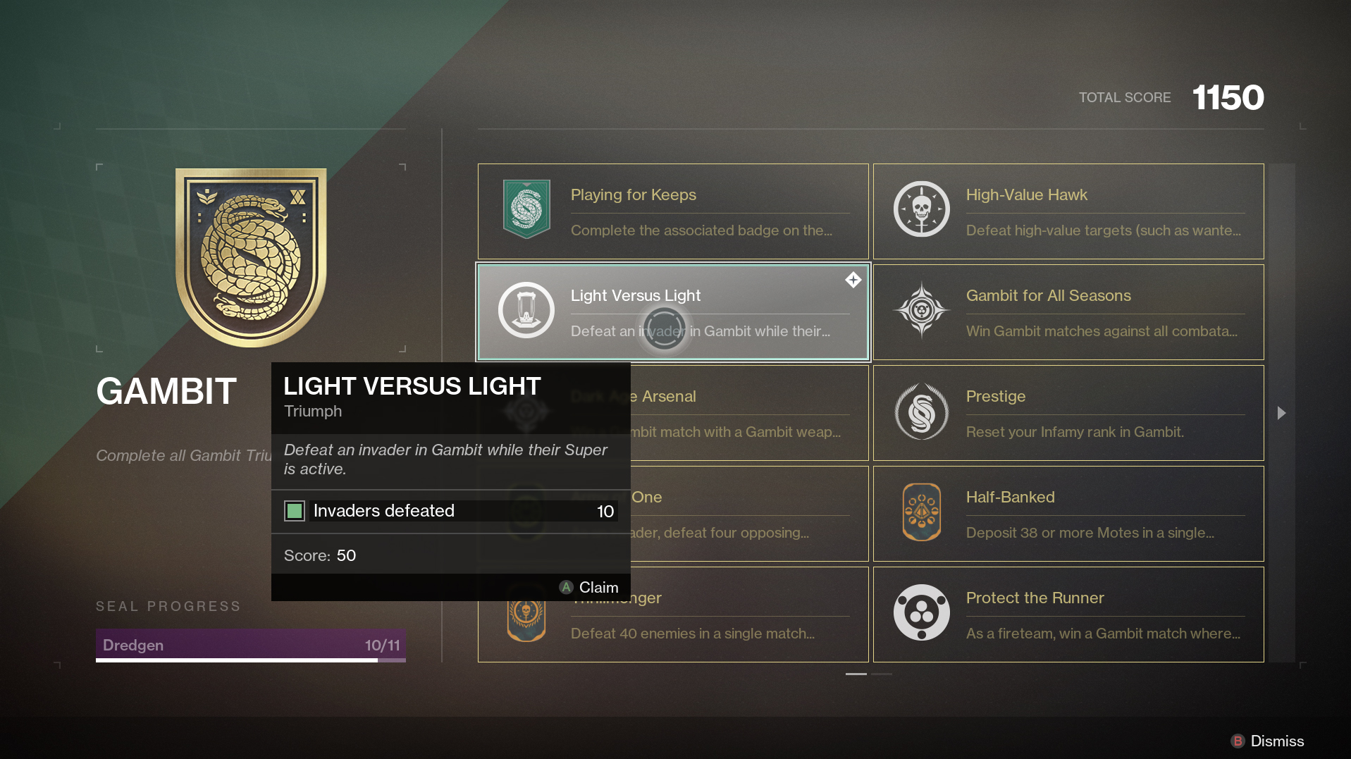
Triumphs
In Forsaken, we added two major new features to the Destiny 2 UI - ‘Triumphs’ and ‘Collections’ - giving players an in-game hub to track their activities, acquisitions, and achievements. I was the sole UI content creator working on these features for most of the release’s development, taking them from initial concepts to final polish, working with artists to create new visual languages and styles, as well as establish new UX flows to support initial and future content.
I worked with engineering on significant revamp and updates to Destiny 2’s free cursor input, working on revamp and tuning to support new screens and improve input feel throughout the UI.
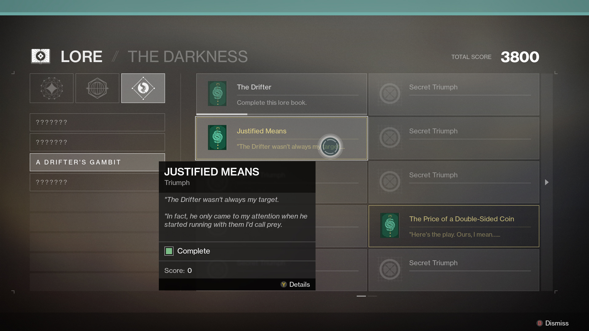
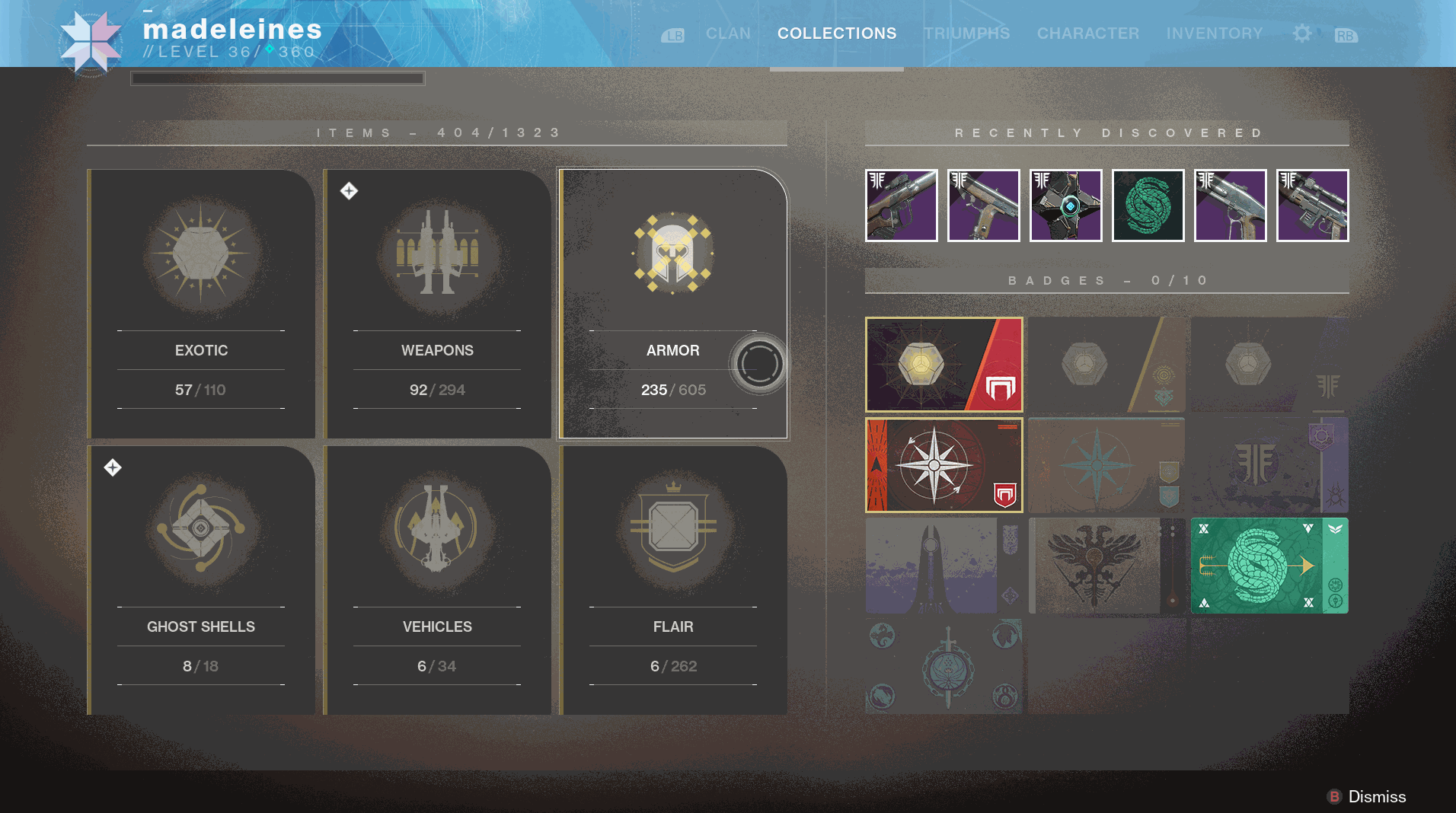
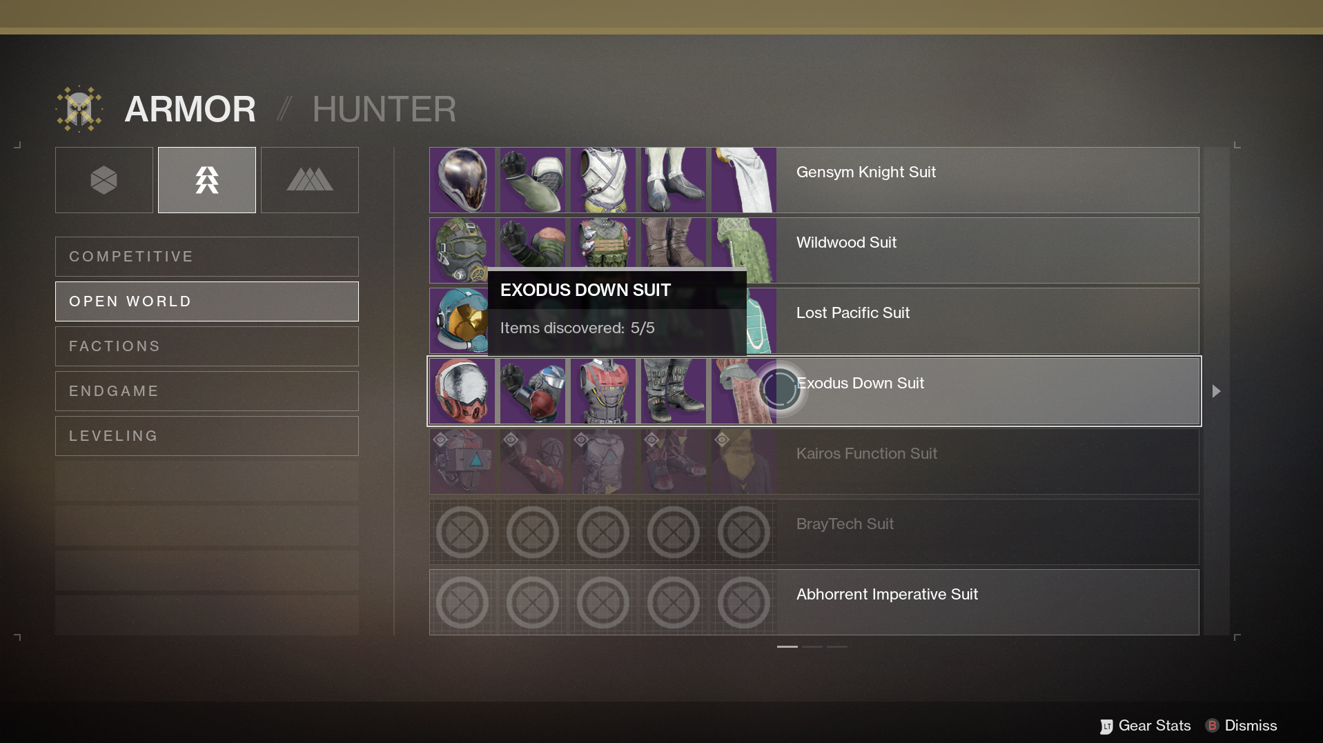
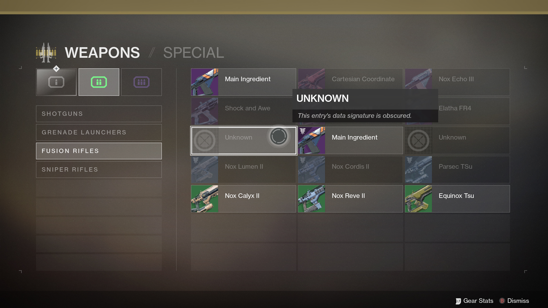
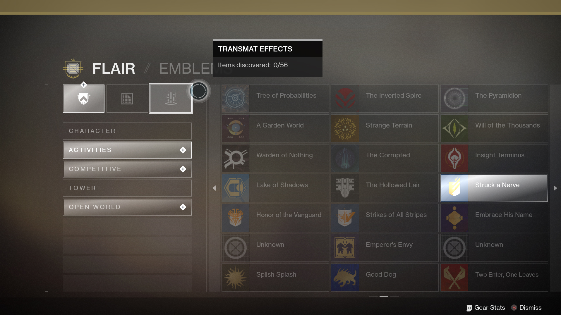
Collections
A sister to Triumphs, Forsaken resurrected the Collections feature from Destiny 1 — highly expanded and redesigned, with cleaner layout, navigation, and much more extensive information. I built the Triumphs and Collections features to have distinct landing pages, but share a central architecture for their sub-screens, allowing for quick iteration and easy scaling for future updates, as well as a shared visual language for player to understand and a consistent visual layout.
At its core, Collections was built to use the same basic tech as Triumphs but with a unique look and feel for players, but allowing for easy scaling and implementation for the design team. I also worked on input and action mappings throughout the new feature set, to ensure usability and consistency with existing UI features.
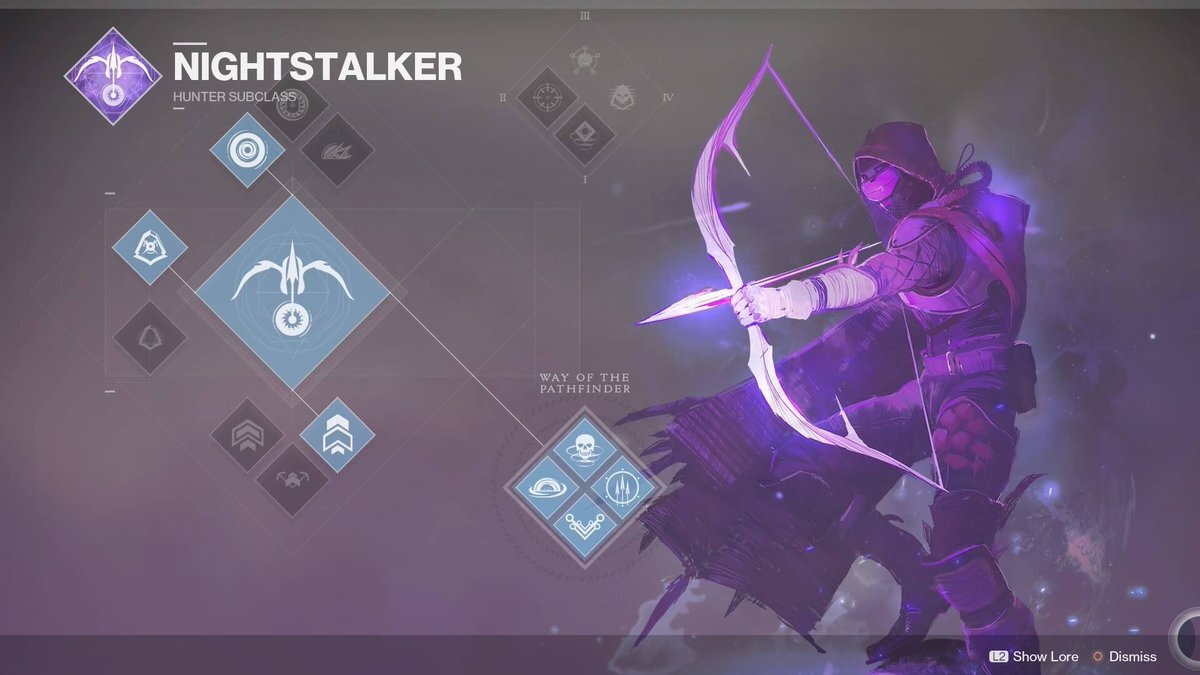
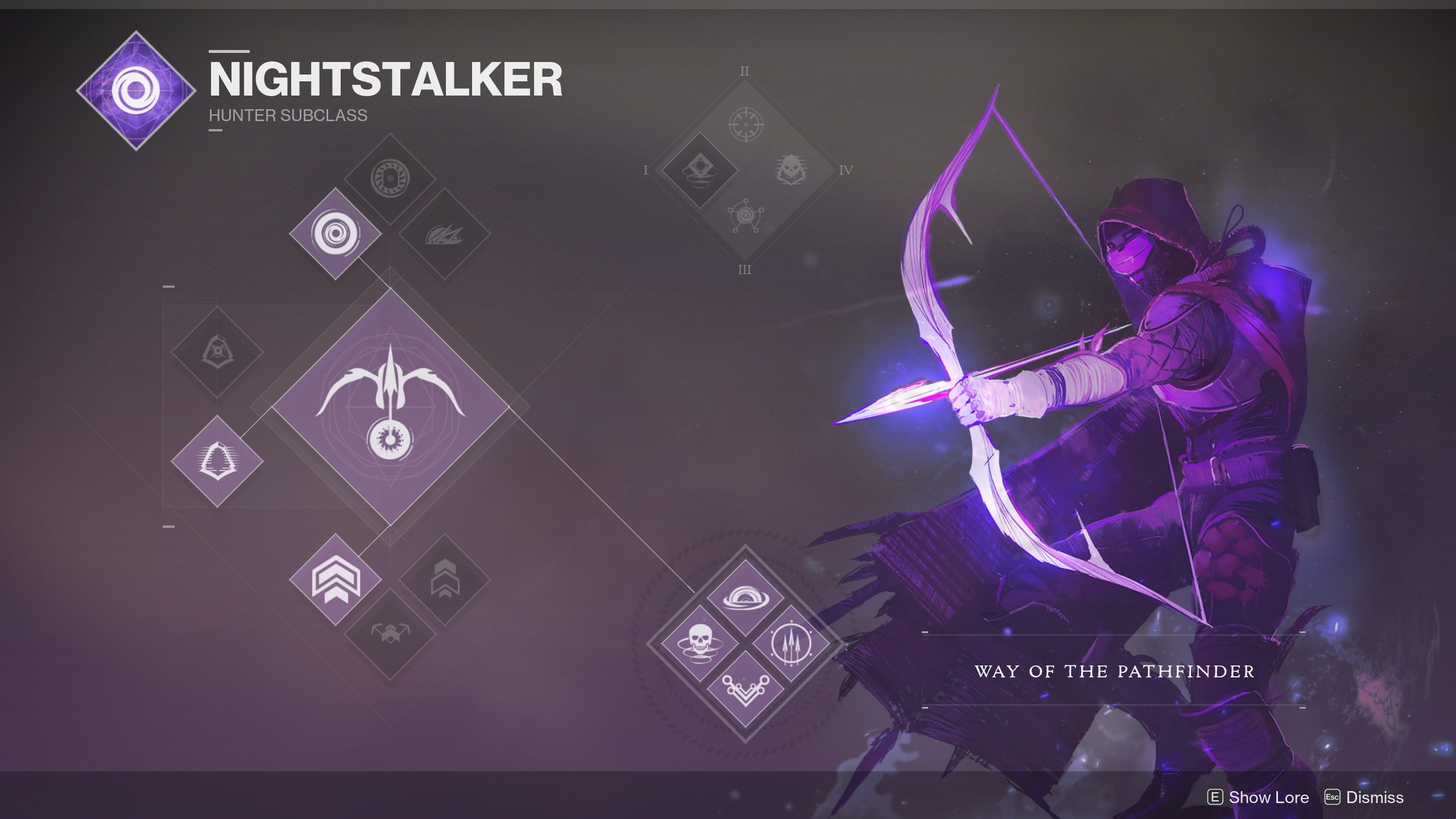
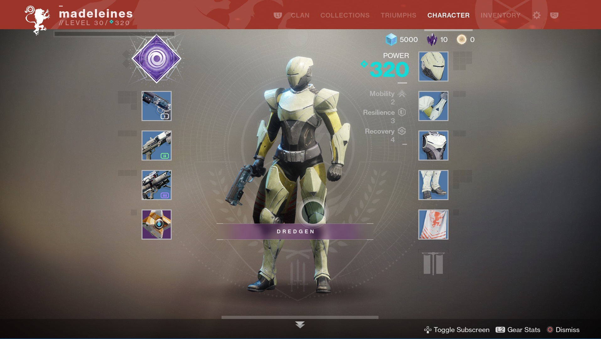
Subclass Screen redesign
In Destiny 2 I helped implement the revamp to the subclass screen, a significant change from the original the look and feel of Destiny. I had pitched the color-matching of the nodes to the subclass colors back for the initial Destiny 2 release, but unfortunately it was punted until Forsaken. It was a very small change, but had a notable impact on the feel of the subclass screens — tying together the UI, art, and gameplay feel of the subclasses into a cohesive design.
User & competitor research
In addition to creation and implementation of UI features, I also helped to further our understanding of players and our competitors by profiling, researching, and presenting data to our team, so we could understand how best to design or change strategies and features, and keep our game competitive and up-to-date in an ever-changing arena. I analyzed and compiled data on various features and their implementations across other games and generated reports and presentations for the UI team and Destiny leadership, as well as researched into player reactions to specific changes and formulated recommendations from that data. My research helped inform direction for creative leadership as well as design in multiple disciplines, including gameplay, UI, and monetization. This included extensive competitor and player-response research used to inform the design of features like Triumphs & Collections, Eververse storefront, and roadmaps and sunsetting plans for future Destiny releases.